

thriftUP!
An event listing website to keep users informed and up to date on pop-up markets near them.

ROLE
📲 UX Designer
TOOLS
💻 Figma & Figjam
SKILLS
📄 User Research, Prototyping, UI Design, Lean UX/Scrum
DURATION
🗓 8 weeks (2023)
THE BEGINNING
OVERVIEW
In the Fall semester of 2023, I had the opportunity to take Interaction Design 2 as a student at Kennesaw State University. In this class, we used an adapted form of the Lean UX process to simulate a realistic UI/UX design scenario. As a class, we read from Lean UX (3rd Edition) by Jeff Gothelf and Josh Seiden and learned about the Lean UX process that we were going to undertake.
ThriftUP aids in providing accurate information about local pop-up thrift and artist markets to both vendors and customers. It also allows customers to more closely connect with vendors and vendors the opportunities to connect with each other and get involved in more markets. It accomplishes these services by offering users a list of events near them, which they can sort by distance or upcoming date.
Customers can make an account, save events, sign up for text or email notifications and reminders about events, review events and vendors, and access details about events down to the parking directions. Vendors can also make an account, list a market online, be named Local Vendor of the Month, find markets to vend at and post which markets they'll be attending.
From there, each student came up with an idea for a website or mobile app and pitched it to the class with a visual presentation. We then voted for our favorite ideas, and were split into teams.
As an avid attender of pop-up markets myself, I voted for Madelyn Grimes' idea of an event listing website for local thrift and artist markets (which was later named ThriftUP) as my first choice and was lucky enough to be placed on her team, along with Gabrielle Horton and Marcel Wheat.
WHAT DID WE DESIGN?
EXECUTIVE SUMMARY
APPROACH
HOW DID WE DESIGN?
LEAN UX
Lean UX is an approach to user experience design focused on delivering value to users quickly, inspired by the principles of lean thinking, Agile methods, and elements of Scrum, an Agile framework. Agile methodologies emphasize collaboration, continuous iteration, the ability to adapt and readapt based off of user feedback, responsiveness to change, and flexibility.
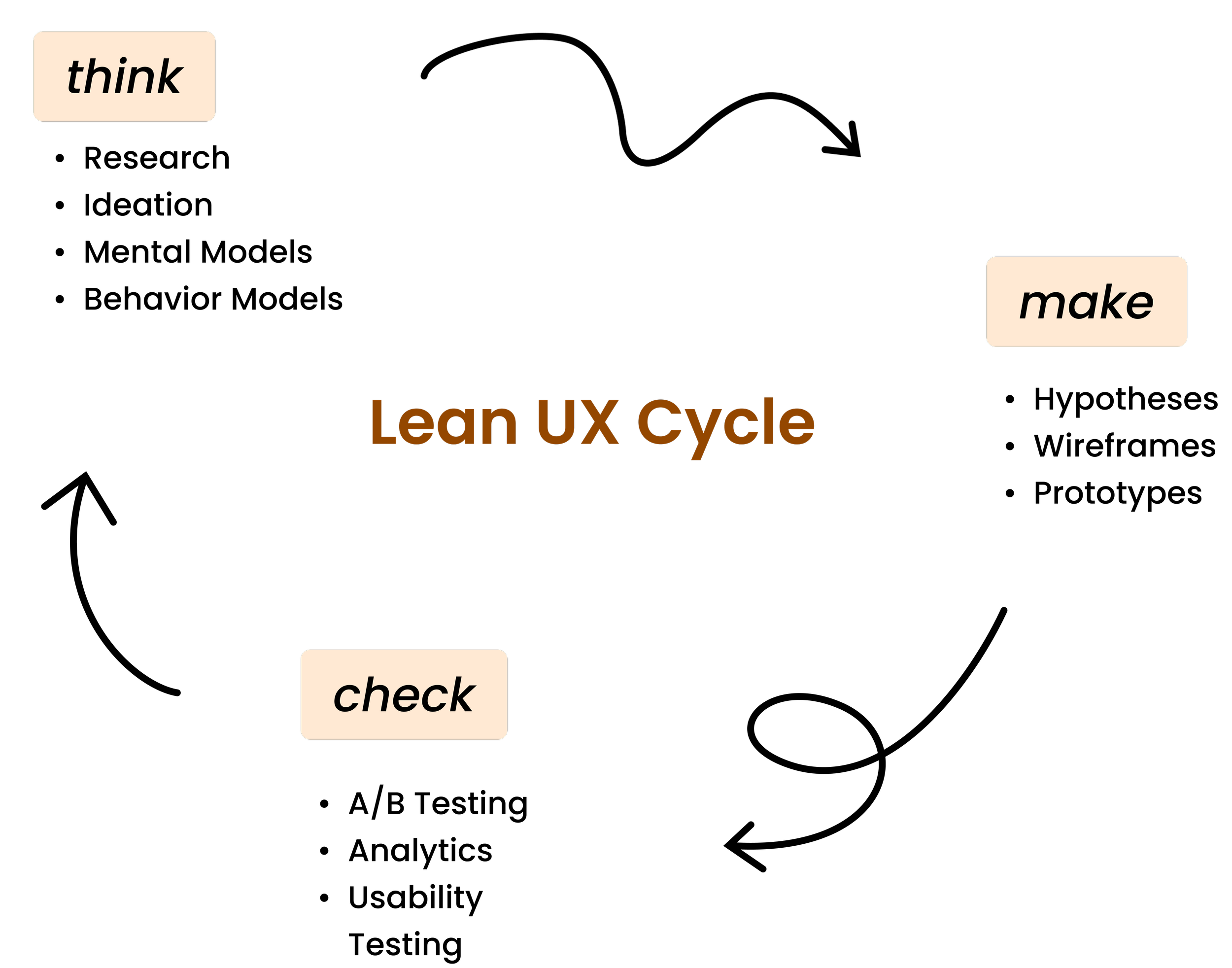
Scrum specifically introduced the concept of "sprints" or timed iterations. While Lean UX doesn't always include sprints, our class followed a structure of two sprints, both three weeks long and beginning with a design week zero. We also engaged in two-day stand-ups as a team, meaning that every other day we would have a quick meeting to make sure we stayed on the same page.
SPRINT ONE
Our team began working on a Lean UX Canvas, a visual tool used in Lean UX to help teams quickly and collaboratively create and communicate key aspects of a project. It is a one-page overview that can continue to be updated and refined throughout the design process.
Then, a week was spent working on the initial prototype and interviewing potential users. The next and final week of the sprint consisted of continuing work on the prototype, making changes based upon interview feedback and interviewing more potential users.
DESIGN WEEK ZERO
In Design Week Zero, the idea is to align the design team, product owners, and other stakeholders on the project's goals, user needs, and design direction before entering into the regular sprint cycles. It should be noted that this was a classroom simulation, so there were no real stakeholders or product owners.
Our team worked together on a Lean UX Canvas with eight sections: Business Problem, Business Outcomes, Users, User Outcomes and Benefits, Solutions, Hypotheses, Assumptions, and MVPS and Experiments.
PROBLEM STATEMENT:
The current state of local thrift community has focused primarily on local consumers, advertisements and sales, and design aesthetics.
What existing products/services fail to address is the user having to dig for information with other products and platforms.
Our product/service will address this gap by providing accessible timely information on local events in one place.
In our meetings this week, we asked ourselves many questions such as, “How will we know we have solved the business problem?”, “What will we measure?”, “What’s the most important thing we need to learn first?”, and most importantly, “What’s the least amount of work we need to do to learn the next most important thing?”
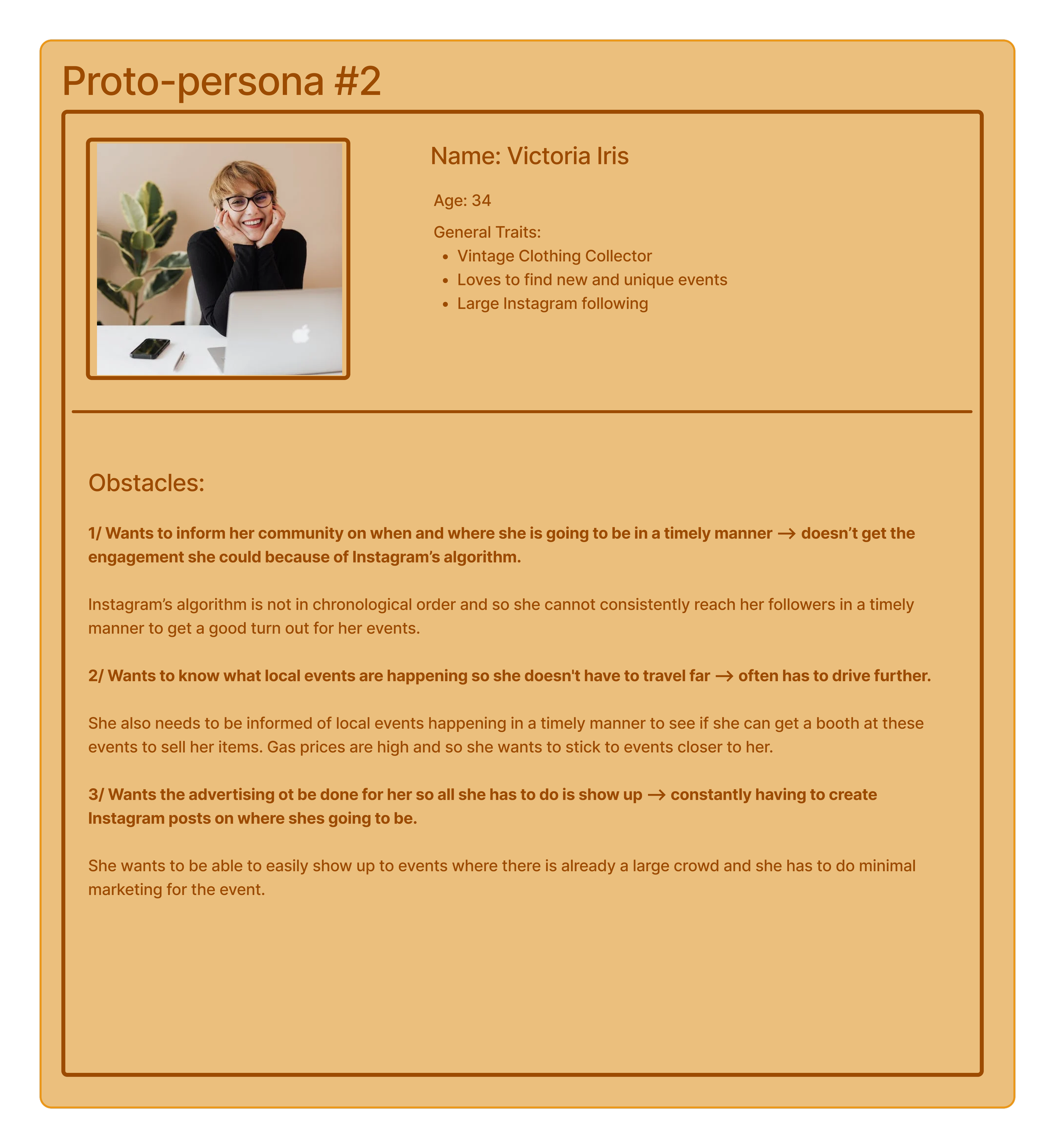
PROTO-PERSONAS
Another question we asked ourselves was, “Which types of users or customers we should focus on first?" We responded by creating two proto-personas, August and Victoria. Proto-personas are hypothetical representations of users based on limited information and assumptions. They serve as a starting point for designing until more user research is done.

SPRINT 1 BACKLOG
Another question we asked ourselves was, “Which types of users or customers we should focus on first?" We responded by creating two proto-personas, August and Victoria. Proto-personas are hypothetical representations of users based on limited information and assumptions. They serve as a starting point for designing until more user research is done.
Sprint Week 1
We started following a two-day stand-up structure. A stand-up is a quick daily meeting with team members to discuss progress, expectations, possible issues and tasks. Our team met virtually on Tuesday, Thursday, and Saturday mornings for our stand-ups. Following this structure allowed us to stay connected and collaborative.
As Week 1 began, we focused on building a very basic prototype of our home page, event page, and event ambassador sign-up page. However, in our first stand-up meeting, we decided against the "event ambassador" idea altogether. There had been debate over if this feature was valuable, and ultimately we found that we could satisfy the business and user outcomes with other features.
I personally created our Figma prototype file and began a simple wireframe for the pages we had set out to work on.
I also organized an interview with a friend of mine that works at a vintage clothing store which frequently puts on large markets. We were going to interview a total of at least 12 individuals, 3 each Sprint Week.
We interviewed our three people for that week. We asked them general behavioral questions, and also had them test our prototype. After speaking with each individual, our team immediately would get on our Figjam and affinity map. This way, we created a visual map for each interview that helped us to organize the information we received.
All of our interviewee's names have been changed for anonymity, but that week we interviewed Mitch, Daisy, and Hannah. They all offered us a lot of feedback from a customer's point of view.
My overall takeaways from the interviews in Sprint 1 Week 1 are as follows:
Change the comment section on the event pages into a reviews section. This is more useful to our users.
Populate the home page with images and content that draws the user in visually.
Consider the idea of a newsletter with a feature to sign up for it, two interviewees were interested.
Create a vendor list page.
Interviewees are interested in connecting with vendors more.
All three interviewees preferred SMS text notifications to email notifications.
Interviewees thrift to save money, because they think it's more fun than normal shopping, and because it's better for the environment. They also enjoy finding unique pieces you can't find in a regular store.
Sprint Week 2


In Sprint 1 Week 2, we made changes to our prototype based off of the feedback we received in Week 1. I helped to create a style guide for our website. Madelyn Grimes picked out the colors, while I picked out the fonts used and assigned text styles. I made edits to our navbar to make it look more real. I also began prototyping the notification, save, and share icons on the event pages. I created and populated a vendor list page and changed all of the comment sections into reviews sections. I prototyped the stars in the reviews section to fill up when clicked, in order to simulate a realistic experience of leaving a review.
We interviewed Samuel, Laura, and Debrah that week. I was unable to attend these interviews, but from the affinity maps, I compiled this brief summary of the feedback received.
Everyone found the reviews helpful. This was a good addition.
Our interviewees expressed an interest in a social aspect of the website. (i.e. being able to make an account, follow vendors, the possibility of a "for you" page)
Each person emphasized the importance of detailed information on the event pages. (i.e. parking information, snapshot of what will be there)
Our interviewees would use the notifications, share, and rsvp features.
Populate the home page more.
The interviewees thought the color choices were decent, could be improved.
The end of Week 2 also meant the end of Sprint 1, so our team prepared to have a retrospective meeting once all of our interviews were done. In Lean UX, a retrospective is a team meeting at the end of a project or iteration where members go over what went right, what could be improved, and what to try next.

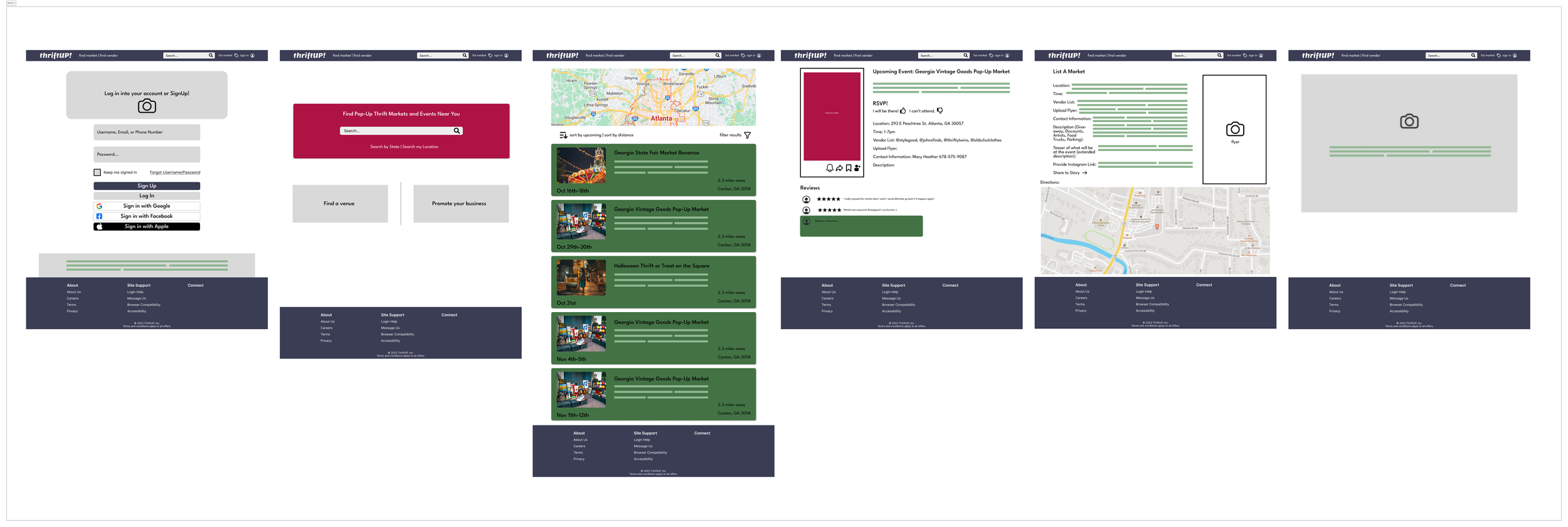
At the end of Sprint 1, our prototype looked like this:

Sprint 2
We saved our work from Sprint 1, made a copy, and began our second iteration. Going into Sprint 2, our team had a large list of improvements to be made, both in our prototype and in our team dynamic. We also had a lot of new feedback on the prototype. Our team conducted user research in Sprint 1 that could potentially influence our Lean UX canvas.
Design Week Zero
Lucky for us, we got to start all over with another Design Week Zero. Technically, however, we were performing a revalidation, meaning that we were revisiting our first iteration and checking to see that our content was still relevant. We were permitted to copy information over from our first iteration of the canvas if it was still true, but still went through each section carefully.
In the Business Problem section, we did not redo our brainstorming activity, but we made edits to our problem statement:
The current state of pop-up thrift markets has focused primarily on spreading disjointed information for community events and has a lack of cohesion.
What existing products/services fail to address is the user having to dig for information with other products and platforms as well as lack of awareness of events.
Our product/service will address this gap by providing accessible timely information on local events in one place. Our initial focus will be the user experience of locals looking for timely information on local events. Our secondary focus will be event coordinators and vendors that are seeking exposure for their brand or event.
We'll know we are successful when we see vendors, businesses, and users engaging with the website, by interacting with site elements i.e.. rsvp's, browsing, etc.
In addition, we made slight edits to the Business Outcomes section by rearranging our Outcome-to-Impact mapping. We also edited our proto-personas in the Users section to more accurately reflect our potential users and their goals.


Our User Outcomes and Benefits section remained completely the same, as well as the Solutions section. However, once we got to our Hypotheses section, we almost completely changed our hypothesis table. This resulted in a different version of the hypothesis prioritization canvas. We had five high-risk, low-value hypotheses that we ended up discarding.

Because of these changes, our hypothesis tables in the Assumptions and MVPs and Experiments sections changed also.
Finally, my team ended up with a revalidated product backlog and a new Sprint 2 backlog. From there, we launched into Sprint 2, Week 1.

Sprint Week 1
Sprint Week 2


We continued to follow our two-day stand-up structure in Sprint 2. I began to refine elements on the prototype, implementing frames and auto-layout where there had previously been grouped items. I made duplicates of the event page and populated each of them with images and text content. I prototyped a frame containing an image of a map with clip-content on and scroll behaviors set to all directions. This created an interactive map that users could drag around. I added map markers to the map that matched the locations of the fake events on our prototype. I helped to populate our search results page and prototyped the save icon on the event page to fill in when clicked.
This week, our team was settled into a routine and we each had specific tasks to work on. We completed three more interviews, and these are the highlights I found important from those research/testing sessions:
This week, we began seeing functional issues pop up in our prototype during testing, which was helpful in us quickly correcting the errors. These are issues that we found during interviews and usability testing:
In our first interview, the RSVP function had link errors.
There were also link errors when navigating between vendor pages.
In general, not a lot of elements were clickable.
The sign-in pages need to be changed to better separate vendor and customer onboarding.
The search bar should be functional.
Pop-ups need to be added when certain elements are clicked.
The map markers should be clickable, larger, and have a hover function that says the name of the event the marker belongs to.
The home page needs to be redone, along with the style guide.
Overall, our interviewees started to show more enthusiasm for the website and really enjoyed interacting with our prototype.
Based off of our feedback in Week 1, I redid the entire home page. I also prototyped the notification icon to bring up a pop-up when clicked, and after clicking "yes" and agreeing to notifications, the icon would fill in. I prototyped the search bar to be clickable, and redid the map markers to be larger, say the name of the event the marker belongs to when they're hovered over, and scroll to the corresponding event card in the search results when clicked on. Creating this flow of interactive map to map marker to event card to event page was one of the things I'm most proud of in this project.
I helped fix the link errors identified by our interviewees in Week 1 and helped with the creation of components. I made individual interactive parking maps for each event page, with interactive map markers. Our navigation bar mysteriously stopped functioning correctly, so I helped to fix that. Some footers were not hugging the bottom of the page, and some had rounded edges while others were sharp. I went through and fixed these errors and checked for consistency.
That week, we interviewed our final three individuals. From those interviews, I gathered the following synopsis of information:
The find a vendor page was too "white" and empty, needed to be populated.
The home page needed to be restructured with nearby markets closer to the top of the page.
The stars in the reviews sections on the event pages were not functioning properly and needed to be fixed.
Interviewees liked our RSVP feature, especially the part where they get a message after RSVPing.
Interviewees liked the images we used to populate pages with, and liked the interactive maps.
We reinterviewed one individual who loved our corrections from last time, especially the addition of a mission statement.
The color scheme and style guide still needed to be changed.
Interviewees thought we should spend more time on the aesthetics than the functionality at this point.
The sign-up pages were confusing and needed to be restructured.
By the end of Sprint 2, our prototype had fleshed out a lot more, but still needed a lot of attention.
At the end of Sprint 2, our prototype looked like this:

Refinement
After completing our two sprints, we had a week to tie everything together before turning our project in. During our refinement week, I completely redid the style guide and color styles. I then went through the Refinement iteration of our prototype and changed the color style links to the new ones. I added banners to the tops of some pages because it was visually appealing and showed importance. I helped restructure the home page, with the markets closer to the top. I also made the text over our image on the home page more visible by adding a layer of inner shadow to the image.
We created and voted on logos for our website as well. I prototyped every map and parking map on all of the pages to expand and minimize. After receiving feedback, we changed the share icon to a copy icon. I prototyped the copy icon so that a green check mark would animate and appear briefly after clicking on it. I then checked all of the links for errors and fixed the map markers to function better, as well as the review stars. On the final day of refinement week, our team spent 5 hours on a virtual call and Figma together because our nav bar had broken again. We fixed it and made final touches before presenting our finalized prototype to the class later that day.
At the end of Refinement, our prototype looked like this:

Sprint 1 - Home Page

Sprint 2 - Home Page

Refinement - Home Page

Conclusion
Throughout the process of Lean UX, between canvases and stand-ups, interviews and retrospectives, my team and I kept a clear focus on Project: ThriftUP's user goals while also keeping business goals in mind. By using Lean UX, my team was able to deliver value to our users faster. Continuously iterating in the Sprints 1 and 2 and performing guerilla usability testing in our interviews allowed us to quickly make a minimum viable product and improve on it until it became a successful prototype that fulfilled the goals and needs of our hypothesized, evidence-based users.
In addition to this, my team struggled to find our flow as a group in the beginning but eventually found it. I believe that the value in this process was not only learning and simulating Lean UX, but also learning to work with new people and adapt to better benefit the team.
Lessons Learned
I got to experience the efficiency and quick timeline of Lean UX, which showed me the value of Agile methodology. While it was an uncomfortable and different experience at first to have little documentation and move so fast, I found myself able to abandon my ideas from GDD and fully immerse. I'm glad to have gone through both design processes, as I feel that I better understand the situations in which the two would be used and the values of both.
I would have loved to have had the opportunity to interview some event coordinators who had worked with pop-up markets before. We were able to interview one or two vendors but I think with more time, user research, and testing, we could have improved upon the vendor's pages.
During this project, I learned how to use auto-layout and some tricks with variables on the fly in order to work on our prototype with my best ability.
We waited to make some of our components in our Figma file and made things harder on ourselves. In the future, I'll make components at the very beginning instead of making them as I go.
I learned to be a team member, instead of a leader, and to let go of my vision in order to focus on someone else's.
If I were to go through the process again, I would want our team to be more organized than we were. I would make sure to schedule all interviews at the beginning of the week so we don't end up doing all of them at the last minute. I would try to create a consistent time across days for stand-ups and retrospectives.